Dec 14, 2022
Seeing signs
A book by ERA Architects and Spacing magazine explores the history of Toronto signage
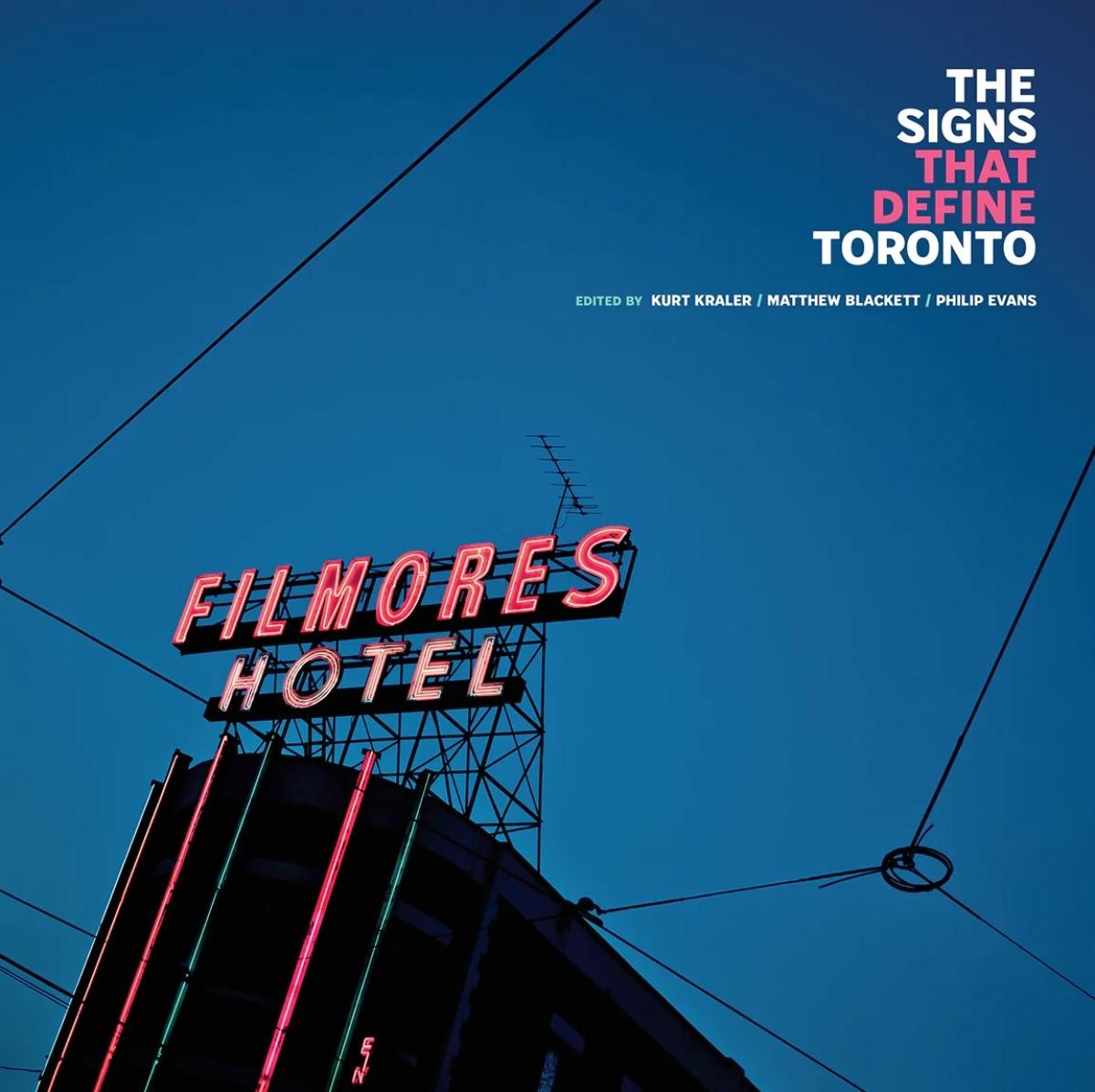
Image courtesy of ERA Architects and Spacing Magazine.
Like any city, the look and feel of Toronto’s urban landscape has changed drastically over the years. In the haste of rapid development, important opportunities to document the cultural history of a city are often missed. Recently, ERA Architects in partnership with Spacing magazine seized such an opportunity via a deep dive into the history of Toronto signs – in the form of a brand-new book.
ERA partner Philip Evans and architect Kurt Kraler have teamed up with Spacing’s Matthew Blackett and 20 other contributors to publish and produce The Signs That Define Toronto. Adorned with striking vintage photography, the book explores the rich and diverse history of Toronto signage, using it as a lens to better understand the city’s ever-evolving identity.
We spoke to Blackett and Kraler to learn more about the inspiration behind the book and asked for their insights about the present and future of Toronto signage.
Foyer: What sparked the idea for this book? What is the inception story?
Kraler: During my graduate studies at the University of Waterloo School of Architecture, I was inspired by the seminal text Learning from Las Vegas by Denise Scott Brown, Robert Venturi and Steven Izenour and explored the history of architecture and development in the Las Vegas area. During one of my trips to Las Vegas, I visited The Neon Museum, which collects, restores and displays old signs. It really opened my eyes to the value of signage in preserving history, especially in a city that doesn’t keep a lot of its heritage buildings. When I started working at ERA Architects, I had a conversation with principal Philip Evans about the current state of signage in Toronto and how more needs to be done to raise awareness about the role of signage in conveying the history of the city. That’s when the idea for a book about Toronto signs arose, raising awareness about the importance of signage and a means to explore the untold stories behind the many signs that we all know and love.
Foyer: In the intro to The Signs That Define Toronto, you describe the book as “an attempt to document the culture of the city through its signs.” Can you share some of your thoughts about the relationship between signs and culture?
Kraler: When Philip and I first proposed the book to the executive team at ERA Architects, Graeme Stewart commented that “signs are like the tattoos of buildings”, meaning that they express the personality and character of the people who live and work inside. Signs are more accessible and can be updated more frequently than the buildings they adorn, reflecting the people who live and work in the city. Signs also convey the culture of the city through the colours used, flags displayed, languages printed and goods and services advertised.
Foyer: Yonge-Dundas Square is Toronto’s mecca of modern signage. What are your thoughts about how it has evolved over the past couple of decades?
Blackett: Its location makes it a natural draw for people to gather. As a vehicle to market products, the Square has been successful, though I think that can be debated. But in almost every other aspect it has failed. As a public space, the focus isn’t on the space at all, but on the screens. You’re encouraged to be a passive participant, so the experience ends up feeling transactional and one-way.
The Square is at its best when the environment is people-centric. We’ve seen it occasionally during significant celebratory events, such as when Sidney Crosby scored the ‘Golden Goal’ at the 2010 Winter Olympics or when the Toronto Raptors won the NBA title in 2019. The Square has been transformed into a dynamic space during Nuit Blanche and Luminato art events, and most recently by photographer Edward Burtynsky’s In the Wake of Progress. We need more of those types of occasions to truly take advantage of the technology that surrounds it.
Foyer: So much of this book unpacks the history of signage. What insight do you think this gives us about the future of signs? Any predictions about how they will look/function in the coming decades?
Blackett: Technology works in unique ways. For a lot of new small businesses, in place of the electrical signage they’ve opted for hand-painted signs or vinyl cut-outs adhered to windows. These options are much more affordable and easier to maintain but are only made possible by new desktop publishing tools and more affordable vinyl-cutting technology. You also see a lot of retro-inspired LED neon, which is more affordable and flexible (both physically and for colour options) but lacks the warmth of neon gas in a glass tube.
Our last chapter, written by the Toronto Star’s technology writer Navneet Alang, dives into the future of signage and location-based marketing — which reacts to things like the weather or a person’s digital presence (i.e., their phone) —and what kind of implications that may present to both advertisers and consumers. Readers will have the grab the book to find out what the future may hold.
Pick up your copy of The Signs That Define Toronto here.