Sound visuals
Two Juno Award nominees talk Best Album Artwork and their collaborations with musicians.

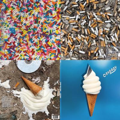
Crybaby by Tegan and Sara (2022). Image courtesy of Emy Storey.
Whether it be a digital stream, download, vinyl or CD, artwork is an essential element when experiencing an album. As musicians invite listeners into an auditory world, an album cover becomes the first and most important visual reference for their journey. The crucial work of visual artists, designers and photographers creates a lens through which we can better understand music.
Sunday, March 12, 2023, marked the 52nd annual Juno Awards, celebrating excellence in the Canadian music industry. In addition to musicians in genres ranging from Reggae to Country, artists responsible for making exceptional album artwork were also honoured. We caught up with two of them to find out more about their work giving music a visual presence.
Art director and graphic designer Emy Storey is behind the album artwork for Tegan and Sara’s Crybaby, and graphic designer and illustrator Jud Haynes created the album artwork for Kubasongs by The Kubasonics – both receiving Juno nods this year for their work.
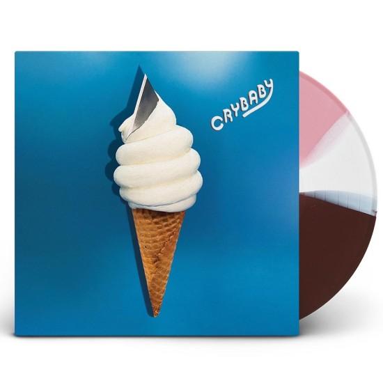
Image courtesy of Emy Storey.
Foyer: Can you describe your approach to creating the album artwork for Crybaby? What was your inspiration?
Storey: Crybaby is Tegan and Sara’s 10th record, exploring themes of childhood, sisterhood and new parenthood. I loved the title and was inspired by the meaning behind the songs, knowing that Sara and her partner Stacy were about to have a baby; wondering how it would change them; wondering also how it would change the relationship between Sara and Tegan as twin sisters. I decided to use the universal trauma of the dropped and contaminated ice cream cone as the campaign's central motif; a taste of what it means to grow up (or not) by visually mixing soft, joyful anticipation with suffering and disappointment. I wanted to contrast something pure and delicious with visual elements that were painful and ruined to tell the story of the loss we’ll inevitably experience in our relationships as children, siblings, parents, lovers and friends.
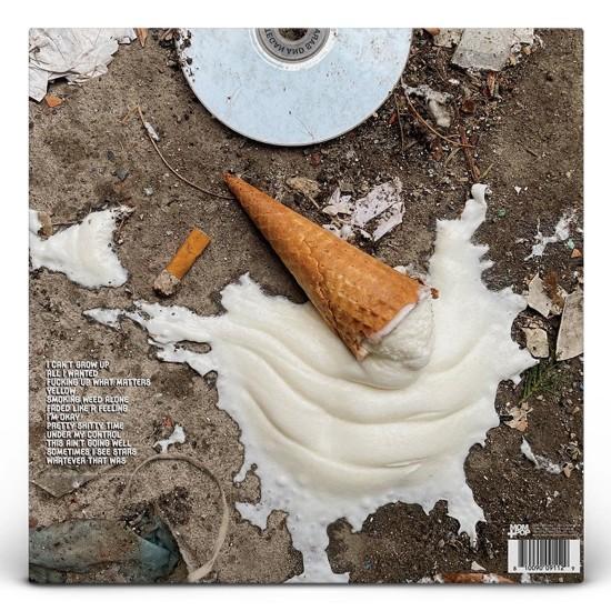
Image courtesy of Emy Storey.
Foyer: Can you share some of the technical details of your process creating the artwork?
Storey: This was the most fun I ever had working on a cover. It involved a lot of ice cream. I tried lots of different spots and ended up using the soft serve cone from a shop just down the block from my house which was really convenient because ice cream melts fast so I was buying two to three cones at a time and then running home to cram razor blades into them and photograph them in a light box. For the back cover I dropped ice cream on the ground and the scene that I ended up going with was my first shot, the garbage is absolutely authentic, I didn’t move a thing. The mask, the broken CD, it was perfection. I did the shoot in March, which is a great time for garbage in Montreal, as the snow is melting and revealing seven months of historic trash. Despite the first shot luck, I continued to photograph more and more dropped ice cream on the streets, experimenting with melting and drying and whatnot. People were so horrified to see the ice creams on the ground, such a visceral, sad reaction. I knew it was the right theme.
For materials, I used real ice cream cones. A light box for the front cover. Light Photoshop; not much editing was needed.
For the inner sleeve, I wrote the lyrics out on a real napkin, cut myself on the razor blade from the ice cream and wiped my bloody, ice cream-covered hands on it. Lol. Authenticity is pleasurable.
Foyer: Can you describe your collaborative process with the artists? What did you discuss and what was their vision for their album cover?
Storey: I’ve been working with Tegan and Sara for about 20 years now. It’s been an amazing creative partnership. This was supposed to be my last cover for them so they just let me go off. Knowing an artist so well on a personal level is really beautiful because you see so many details, references and meanings in their lyrics and sounds, and as is the case with Tegan and Sara particularly, their personalities, humour, and relationship. I saw a lot of depth and beauty in this album and in them. I loved working on this cover and I’m so happy they trusted me and believed in it. In the end it feels like a complete story, which is artistically satisfying and doesn’t always happen… but they let me have that soiled bloody napkin inner sleeve, cigarettes and sprinkles spread and Neapolitan coloured vinyl :)
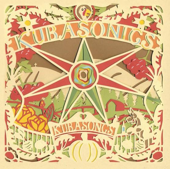
Image courtesy of Jud Haynes.
Foyer: Can you describe your approach to creating the album artwork for Kubasongs? What was your inspiration?
Haynes: I've been a graphic designer/illustrator for a number of years working in different styles. In my personal work I often found myself cutting and layering paper to make illustrations that feel organic and less computer derived – I learned this paper cut art technique traces back more than 200 years to Ukraine and Poland, it's called "vytynanka" and is still very popularly practiced in those countries. When the Ukrainian/Canadian band Kubasonics asked me to work on artwork for their new record I knew this was the perfect match and pitched them on creating an entire design out of paper. The idea was to go as organic as possible, no photography, no computer fonts, no digital art. They loved the idea and we were off to the races.
Foyer: Can you share some of the technical details of your process creating the artwork? (materials used, software you may have used, photography details etc.)
Haynes: The only things I used to make this album artwork was gorgeous paper from the French Paper Company (USA), an exacto knife, and some glue I bought at the drugstore. Any text that wasn't cut out of paper was handwritten using an HB pencil and the only part of the design that needed a computer was the barcode... I even drew the record label and funder logos. It took two weeks to hand-cut and glue the first album cover. Then, more weeks to create the farm animals that represented band members, and other elements that filled out the design. I went through dozens of exacto knife blades and my back aged years while hunched over my worktable.
I spent three to four hours on each copy of the record, getting the sheets cut out, hand-stapling, flattening and trimming the booklets. I then passed them over to the band members who glued each booklet to the covers of the gatefold album covers. The idea was to create a tactile album where the owner can flip through pages of a paper-cut booklet – when closed the booklet made up the album cover image, but as you flipped through the six pages you revealed new items, references to the album’s lyrics, and fun Easter eggs no one would be expecting.
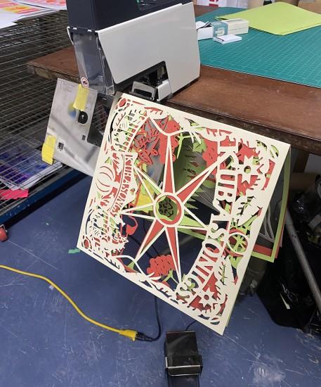
Image courtesy of Jud Haynes.
Foyer: Can you describe your collaborative process with the artist? What did you discuss and what was their vision for their album cover?
Haynes: The Kubasonics are an INCREDIBLE band, and they had made a mind-blowingly great record with Kubasongs. I sat down with the group where we all live in St. John's, Newfoundland to discuss the song themes and lyrics. I learned that much of the record included traditional Ukrainian folk songs about farming, love and relationships, and living off the land in their beautiful home country of Ukraine.
The imagery I created was centred fully around these themes – the band helped me understand cultural traditions from their home and we included as many references as possible. One song tells a story of a man who is trying to impress a woman by buying bigger and flashier farm animals, so we came up with the idea to create a paper cut illustration of the band as these farm animals. Hand-cutting a miniature drum kit out of paper was very fun, I loved every minute of bringing these colourful characters to life from boring flat sheets of substrate.
At the time we were working on the record we had no idea that Putin was planning to invade Ukraine. His view is that Ukraine doesn't have its own culture or identity and we feel the weight of this album far more now that his war is terrorizing a wonderful country like Ukraine. Traditional Ukrainian songs, sped up and turned into raucous "speed-folk", sung in their language with artwork showcasing Ukrainian life in an art style that has been practiced and celebrated in that country for hundreds of years. This album and what it represents has made us all very proud – it's a statement that Putin is wrong, Ukraine does have its own vibrant beautiful identity. They're a strong cultural force, incredible artists, innovators, friends to the world – and Putin will not be able to make them go away. Since its release Kubasonics have been touring extensively, playing festivals and showcasing Ukrainian music, humour and stories, art and fashion to new audiences across Canada who are often experiencing Ukrainian culture for the first time.
